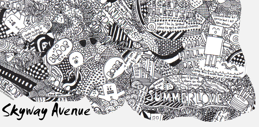
below are some of the sketches I did for the book:

the main challenges with the book assignment was coordinating the colouring amongst the group as it was difficult to achieve a consisitent look, however we manged with rather good results.
posted by Jun @ 8:09 PM
0 Comments
![]()
Assignment 1:
For assignment 1, we had to incorporate our names into 2 designs to show what we 'like' and 'hated'.
For 'like', i chose 'doodling'! As such, my design showed hands in the act of doodling, surrounded by doodles of course! The final design, I used bright colours for the doodles, while a pale skin tone for the arms in order to make the arms stand out and thus my name noticeable.

For the 'hate' design, I chose 'hypocrites', and made used of puppetry to symbolise the manipulative nature of hypocrites. My final piece I decided to use 3 puppets instead of 1 to represent my name, and their awkward positions further serve to accentuate the manipulative sense of hypocrites.

Assignment 2:
Pictogram assignment, I chose to do a sign to warn students of impending stairs! In my final design, I changed the positioning of the arms of the figure to present confusion with covering the years when what I want to portray is a sense of horror! I also modified the look of the stairs so that it looks like the figure is directly in front of the stairs.

Assignment 4:
For our poster assignment, Jing mentioned we cannot use images off the internet, so I replaced the picture of the child with a picture of my young cousins. In addition, I added a frame to the poster, with part of the rainbow coming out of the frame to give the effect of the rainbow popping out at the audience, and the words in the same perspective. This guides the audience from the top of the poster to the bottom, where the website address is located. I also added in blotches of paint to add to the element of fun.

Assignment 5:
The christmas card assignment, my final design I decided to extend the look of the card by using the entire portrait layout. I also chose the colour of the magenta variation as it was unique, a colour not commonly associated with the festive occasion, but somehow it is still able to convey the warm and festive feel of the design.

posted by Jun @ 7:23 PM
0 Comments
![]()
So I set on creating a christmas card. The requirements mentioned about using colours as the main way to convey the message, so I decided to go with a simple, minimalistic kind of design. Using simple lines and shapes, in this case squares of various sizes, I created a christmas tree. And for the all familiar star at the top, I rotated the square to a diamond shape to make it stand out.


Initially the card was suppose to be folded in half, but I realise it actually look much better as a whole portrait piece. And after playing around with the colours, I found the contrasting variations to be rather appealing, in particular the green and pink high contrast. I might be going with the pink version as it looks appealing, but does not seem to be as overused, mainstream feel to it.
posted by Jun @ 8:32 AM
0 Comments
![]()

The captions read:
"When was the last time you had this much fun? Don't let reality rob you of your innocence."
One major problem arised during class sharing, Jing pointed out that we cannot use internet images of any form, thus I will need to go source for an alternative child picture... currently looking at my young cousins to be models... lol...
The child is depicted as sitting on a swing, in this instance a swing made from the letter 'U' which forms the main message. The perspective of the rainbow and the poster is to go with the motion of the swing, as well as to bring viewers' attention towards the captions below.
The vibrant colours was noted that they might be distracting, but I feel they could serve to attract people's attention, as well as convey the message of child-like qualities, fun, vibrant, youthfulness.
posted by Jun @ 8:57 AM
0 Comments
![]()
 And so... on to the assignment proper. The first thing that came to my mind about NUS was... National University of Stairs! Yup... and so I decided to do up a sign to notify people to "beware of impeding stairs ahead!" lol.. for the fun of it!
Inspired by Norwegian artist Edvard Munch's The Scream, which I think almost everyone is aware of:
 And thus the simplification process of The Scream and flight of stairs:
And lo and behold! The final design!
 Some feedback was how much of an effect the stickman actually have in the sign. As I wanted to retain the creative and fun aspect to the sign, which could serve as an eye-catching feature as well. So I will be working on redesigning the stairs and placement of the two elements. The orientation of the sign will still remain as this diamond shape as it provides me with the most amount of space to work with to show the long flight of stairs.
posted by Jun @ 2:38 AM
0 Comments
![]()
 I decided on doing I like doodling and hate hypocrites...
Doodling was rather straight forward, with my initial ideas utilising drawing materials to depict doodling. Somehow I still felt something was missing, finally I decided on taking the second sktech, the one with the super rubber-like-aka-mr-fantastic-arm design and develop it further.
What is doodling without well... DOODLING! so for the expanded design I decided on using hand drawn doodles since my technical 'expertise' (or lack of it) sort of prevented me from digitising it.
For hate, I chose to go with the first sketch showing a puppet being manipulated, much like how a hypocrite is two-faced, manipulative and backstabbing.
So after some doodling...

The arms are depicted as in the midst of creating the doodlings, thus conveying my love for doodling, which is further exuded in the bright and vibrant colours used, to show happiness, liking.
Expanding on the puppet idea, I created a full fledged design using the puppet itself to try and form my name. The back of the design is text taken from a random poem I found on the internet titled "The Hypocrite" by Delivasile Daniel.
 Comments from the class and Jing generally pointed to the inability to really see my name, especially for the 'hate' design. I am satisfied with both ideas, and will thus improve on them, in particular, the 'hate' design to make my name much more visible, and look less like it was 'forced' into the design. Some suggestions were to play around with colours to differentiate the name.
posted by Jun @ 1:05 AM
0 Comments
![]()
posted by Jun @ 10:16 PM
0 Comments
![]()
Jun Lin
A subscriber of Living for the Moment.
An aspiring artist (or so he likes to think) who believes that if he is pleased with his own work, then that is what matters.
And you should too.
For in your own doodle realm... you are truly free...